 Artis.js Documentation
This project is in the development stage.
Thanks for support and feedback!


A low-level and functional virtual CSS library with no CSS codes. More than 80 Utilities. Infinite Configurations.
Introduction
Artis is a tiny 1.4 kilobytes Virtual CSS javascript library inspired from Virtual DOM. Use the custom syntax in the component styling without actually writing the CSS code, and never increase your project file size by adding CSS codes.
Benefits
- No tree-shaking CSS classes
- No Extra CSS bundling
- No CSS blocking
- No CSS codes
- Fast render
Getting Started
$ npm i artis --save-dev
Create an empty template to learn how to use Artis.js with CLI (command-line interface). Without installing anything to setup a new project. After the installation, follow the on-screen instructions and you are done setup.
$ npx artis-cli@latest my-new-artis-project
Playground
The Playground is an online code editor, you can use it for testing or just playing around with Artis.js on the go. If you don't find the CLI is more convenient.
Launch Playground now!
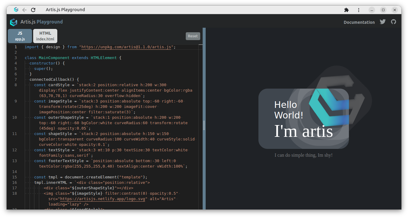
- Press F1 to open Palette menu to access advanced options.
- Press Reset button to delete data stored in the browser.
API Introduction
Set design() to true to enable functional low-level DOM CSS styling without writing CSS and no CSS payload. Up to 50+ different type of useful utilities and each utility has countless modifier that allows you to fine-tuning the utility more precisely.
The Artis Syntax is look like below,
{utilityName}{:}{valueModifier}
Which is equilvalent to...
<div class="textSize:40"></div>
font-size: 40px;
const style = "textSize:40 textColor:rgba(22,22,22,0.5)";
Let's craft something!
Let's create 2 files below with Vanilla JS by using the native web component.
// app.js
import { design } from "artis";

class MainComponent extends HTMLElement {
  constructor() {
    super();
  }
  connectedCallback() {
    const style = `
      p:20
      m:20
      textSize:50
      bgColor:white
      curveRadius:20
    `;
    const tmpl = document.createElement("template");
    tmpl.innerHTML = `
      <div class="${style}">
        Hello World!
      </div>
    `;
    this.appendChild(tmpl.content.cloneNode(true));
    design(true); // init artis.js
  }
}
customElements.define("main-component", MainComponent);
2
3
4
5
6
7
8
9
10
11
12
13
14
15
16
17
18
19
20
21
22
23
24
25
26
<!-- index.html -->
<body class="m:0 p:0 textColor:black bgColor:white listStyle:none display:flex justifyContent:center alignItems:center">
  <main-component></main-component>
</body>
2
3
4
Create a group of complex styled components and reuse them anywhere in the project.
// Example #3

// style.js
export const reset = "m:0 p:0 listStyle:none textSize:16 textColor:black bgColor:white"; // normalizer
export const center = "display:flex justifyContent:center alignItems:center";
export const centerCol = `${center} flexDirection:column`;
export const centerRow = `${center} flexDirection:row`;
export const paddingWide = "pt:60 pb:60 pl:20 pr:20";

// app.js
import {
  reset,
  center,
  centerCol,
  centerRow,
  paddingWide
} from "./styler";
2
3
4
5
6
7
8
9
10
11
12
13
14
15
16
17
That's all you need to learn to use Artis.js. Simply minimalist.
API: Typography
| Utility | DOM Style Objects | Usage |
|---|---|---|
| columnCount | style.columnCount | Reference |
| columnFill | style.columnFill | Reference |
| columnGap | style.columnGap | Reference |
| columnRuleColor | style.columnRuleColor | Reference |
| columnRuleStyle | style.columnRuleStyle | Reference |
| columnRuleWidth | style.columnRuleWidth | Reference |
| columnSpan | style.columnSpan | Reference |
| fontFamily | style.fontFamily | Reference |
| fontStyle | style.fontStyle | Reference |
| fontWeight | vfontWeight | Reference |
| lineHeight | style.lineHeight | 0px |
| listStyle | style.listStyle | Reference |
| textAlign | style.textAlign | Reference |
| textColor | style.color | rgba(0,0,0,0) |
| textDeco | style.textDecoration | Reference |
| textDecoColor | style.textDecorationColor | Reference |
| textDirection | style.direction | Reference |
| textOverflow | style.textOverflow | Reference |
| textSize | style.fontSize | 0px |
| textTransform | style.textTransform | Reference |
| whiteSpace | style.whiteSpace | Reference |
| wordWrap | style.wordWrap | Reference |
API: Backgrounds
| Utility | DOM Style Objects | Usage |
|---|---|---|
| bgColor | style.backgroundColor | rgba(0,0,0,0) |
| opacity | style.opacity | Opacity |
API: Borders
| Utility | DOM Style Objects | Usage |
|---|---|---|
| curveColor | style.borderColor | rgba(0,0,0,0) |
| curveRadius | style.borderRadius | 0px |
| curveStyle | style.borderStyle | Reference |
| curveWidth | style.borderWidth | 0px |
API: Sizing
| Utility | DOM Style Objects | Usage |
|---|---|---|
| h | style.height | 0px |
| w | style.width | 0px |
| maxH | style.maxHeight | Reference |
| minH | style.minHeight | Reference |
| maxW | style.maxWidth | Reference |
| minW | style.minWidth | Reference |
| vHeight | style.height | Reference |
| vWidth | style.width | Reference |
API: Spacing
| Utility | DOM Style Objects | Usage |
|---|---|---|
| m | style.margin | 0px |
| ml | style.marginLeft | 0px |
| mr | style.marginRight | 0px |
| mt | style.marginTop | 0px |
| mb | marginBottom | 0px |
| p | style.padding | 0px |
| pl | style.paddingLeft | 0px |
| pr | style.paddingRight | 0px |
| pt | style.paddingTop | 0px |
| pb | style.paddingBottom | 0px |
API: Flex
| Utility | DOM Style Objects | Usage |
|---|---|---|
| alignContent | style.alignContent | Reference |
| alignItems | style.alignItems | 0px |
| alignSelf | style.alignSelf | Reference |
| flexBasis | style.flexBasis | Reference |
| flexDefault | style.flex | Reference |
| flexDirection | style.flexDirection | Reference |
| flexGrow | style.flexGrow | Reference |
| flexShrink | style.flexShrink | Reference |
| flexWrap | style.flexWrap | Reference |
| justifyContent | style.justifyContent | Reference |
| order | style.order | Reference |
API: Interactivity
| Utility | DOM Style Objects | Usage |
|---|---|---|
| cursor | style.cursor | Reference |
| outlineColor | style.outlineColor | Reference |
| outlineOffset | style.outlineOffset | Reference |
| outlineStyle | style.outlineStyle | Reference |
| outlineWidth | style.outlineWidth | Reference |
| resize | style.resize | Refrence |
| scroll | style.scrollBehaviour | Reference |
| select | style.userSelect | Reference |
API: Layouts
| Utility | DOM Style Objects | Usage |
|---|---|---|
| left | style.left | 0px |
| right | style.right | 0px |
| top | style.top | 0px |
| bottom | style.bottom | 0px |
| clear | style.clear | Reference |
| display | style.display | Reference |
| float | style.cssfloat | Reference |
| overflow | style.overflow | Reference |
| overflowX | style.overflowX | Reference |
| overflowY | style.overflowY | Reference |
| imageFit | style.objectFit | Reference |
| imagePosition | style.objectPosition | Reference |
| position | style.position | Reference |
| clip | style.clip | Reference |
| show | style.visibility | Reference |
| stack | style.zIndex | Reference |
API: Filters
| Utility | DOM Style Objects | Usage |
|---|---|---|
| filter | style.filter | Filter |
API: Transitions
| Utility | DOM Style Objects | Usage |
|---|---|---|
| transition | style.transition | Reference |
Thanks for reading.